4 Tips for Choosing a Logo Font
Choosing a font for a logo design can be tough. These tips will help you make that decision-making process a lot easier.
1. Serif or Sans-Serif?
One of the first decisions you’ll have to make when choosing a font for a logo is deciding whether to use a serif font or a sans-serif font. While there are many other types of fonts used in logo design, it will always come down to serif and sans-serif as they play a key role in defining the brand and the business behind a logo.
The type of font you choose for your logo will determine whether it’s a formal brand or a casual brand. You’ll notice how almost every luxury clothing brand or multinational corporation uses serif fonts in its logo design. While more personal and casual brands use sans-serif fonts.
It’s important that you also follow this trend when choosing a font for your logo to keep the design consistent with your company branding and to make it more appealing to your target audience.
2. Choose a Font Based on Logo Usage
Think about where and how your logo will be used. Are you designing a logo for a mobile app? Then you should pick a font with a crispy design that looks great on all sizes of device screens. Are you designing a logo that gets printed on stationery and posters? Then you need to find a font that can be resized without affecting its clarity.
Imagine using a thick bold font in your logo and having to print it on a letterhead. It won’t look as great or clearly visible when it’s printed on paper. So think carefully about how and where the logo will be used when choosing the font.
3. Use a Font That Match Your Brand’s Identity
The logo is a part of a brand’s identity. It’s what helps define the company and make the brand instantly recognizable no matter where you see it. The font you use for the logo should also be part of the personality of the brand.
Take logos like Burger King, Baskin Robbins, and Walt Disney, for example. You can instantly see the user-friendly and fun side of these companies in their font designs. Make sure you take your brand’s personality into account when choosing a font for your brand logo.
4. Find Inspiration in Other Designs
A logo has to look unique and original to make your brand stand out from the crowd. Of course, finding inspiration for a unique design is not as easy as it sounds. Some logo designers like Paul Rand spend months and sometimes years designing a single logo.
Surely you can’t afford to design just one logo per year. So learn to find inspiration from other logo designs and designers. And remember, it’s OK to steal a few ideas from other brand logos and even to use templates as the foundation to create unique logos.
FLIX – Unique Display & Logo Font

Flix is a bold display font with a stylish rounded character design that gives it a unique identity of its own. It comes in two styles featuring regular and outline typefaces.
The creative and casual design of the letters makes this font a perfect choice for designing logos for many different types of brands from startups to design agencies and much more.
Why This Is A Top Pick
This font is simply perfect for making a logo that stands on its own without needing the help of symbols or emblems. The font will also look great on other types of branding and stationery designs as well.
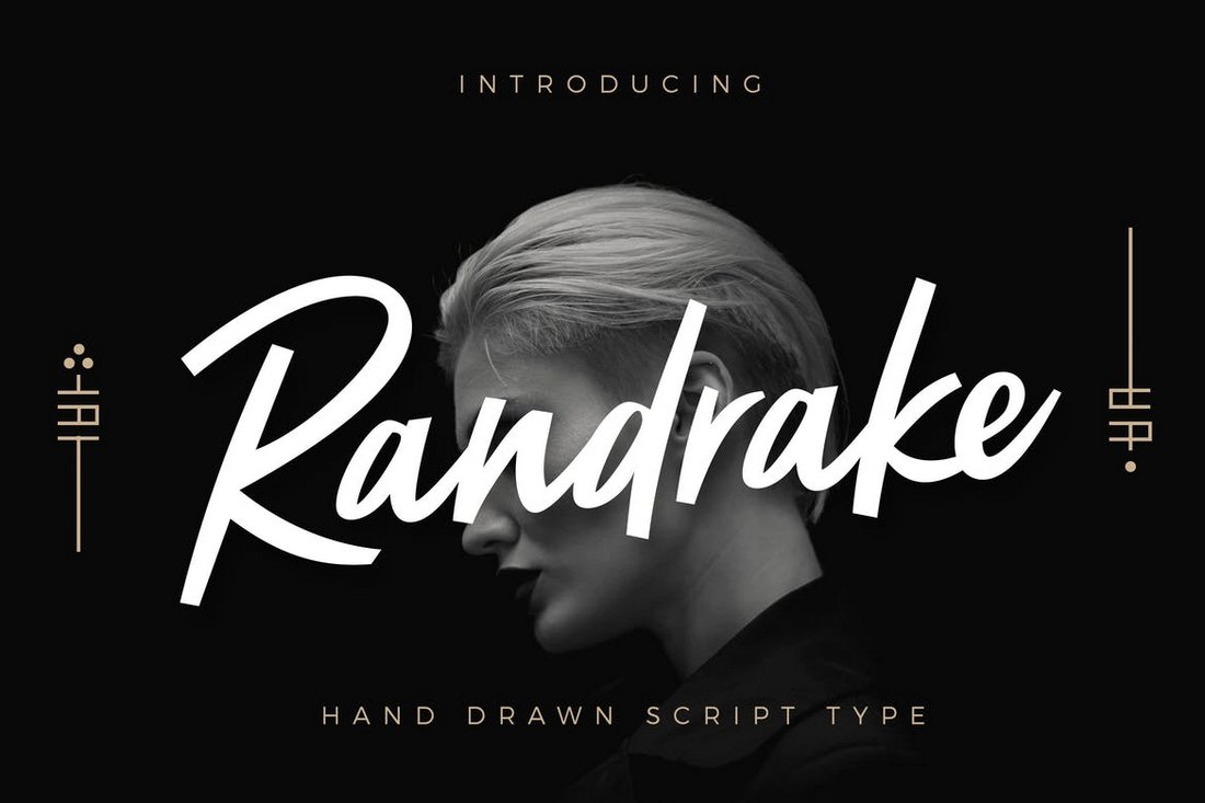
Randrake – Modern Script Logo Font

Randrake is a modern logo font that comes with a stylish script design. This font is ideal for crafting logos for luxury, fashion, and apparel brands. The unique design of the characters will make this font fit in well with both digital and print design

No responses yet